Data visualisation and colour blindness
John Dodsworth is a director of Beacon Dodsworth and has worked with geographical information systems since the early 1990s. Those of us who work with him know that he is colour blind, a fact that those who have used the GIS systems and maps he has created might be surprised to hear. With the current prevalence of infographics and data maps daubed in red informing us about the latest social, financial, or health crisis; John wanted to write about his experience of colour blindness in a world of colourful data, charts and maps.
Colour blindness and a career in mapping
I am colour blind (CB). There are several types of colour blindness. Mine is a common one that I call red-green colour blind because the technical terms, deutan colour blindness, deuteranopia, or Daltonism, don’t convey it any better. I am not blind (just not very observant) and I do see colour (monochromatic visual impairment is extremely rare). About 8% of males are CB.
It is an interesting condition: I find it not so bad to be life-limiting, but for many people there are daily frustrations and obstacles that could easily be helped by awareness and easily and cheaply implemented techniques. As a CB person you never know what you are missing (despite being told by well-sighted, and hopefully well-meaning, people). One advantage it does give is a tiny insight to the world of someone who does have a life-limiting condition.
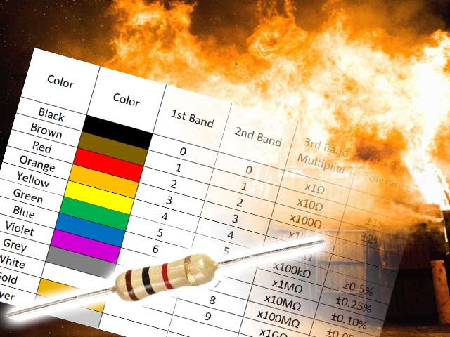
Whilst not life-limiting, there are several professions barred for CBs, often for good reason. For example, when I was young I wanted to be an electronics engineer but being unable to distinguish the colour bands on resistors quickly suggested that I should get my kicks elsewhere; that has probably contributed hugely to national safety.
I can’t claim that data mapping is the perfect industry for someone with colour blindness either; especially with people’s natural propensity to use red-amber-green as a default colour choice on many kinds of map. But it has given me a useful take on displaying maps that are accessible, and understandable, to all audiences.
Changing perceptions of colour blindness?
I didn’t know until my teens that I was CB. At school I was criticised for drawing purple skies and brown grass with crayons so I quickly learned to use only crayons that still had the paper wrapper with the colour name on. You see, we know that grass “is” green and sky “is” blue in the same way that anyone does. I also recall joining in with the “aren’t the autumn colours wonderful?” chorus while secretly wondering what all the fuss was about. I love autumn for quite different reasons.
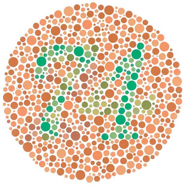
My older sister at secondary school even did a school science presentation on colour blindness and used me as an object lesson. By that time I had come across the Ishihara test and I wonder how many others have been equally delighted to see either nothing or the “wrong” numbers on those splashes of coloured dots. Simple testing still isn’t as widespread as it should be.
Unfortunately I can’t say that attitudes have really changed much over the years. A recent visit for new glasses surprised me when, well into the eye test, the optician asked “which is clearer, red or green?” and when I told him I couldn’t distinguish them, sighed and simply moved on to the next test.
Presenting visual data to the colour blind
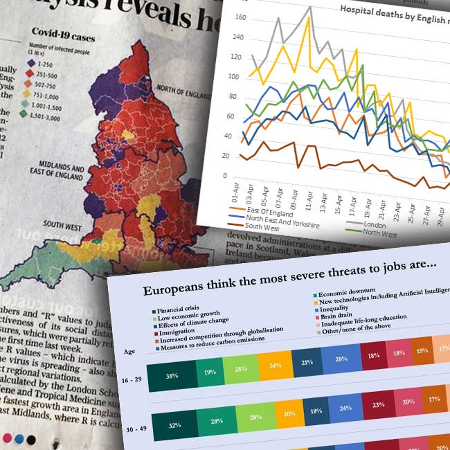
Colour Blindness, like any deficiency, causes one to seek other cues and clues in a wider range of factors such as context, pattern or texture. I’ve learnt that colour alone, no matter how striking it may seem to you, isn’t enough to convey meaning to every audience. The coronavirus pandemic really brought this to the front of my mind as every agency, outlet, and influencer bombarded us with charts and maps to try and help us make sense of those strange days.
Charts with lots of different-coloured wiggly lines tell us when we can expect to die. CB folk can’t work out what their chances are because so many of the lines are similar colours. The key (legend) is rendered useless unless the lines themselves are labelled in some other way or very contrasting colours are used. Even block colour can be a problem.
Colour blindness and mapping
What’s true of charts is also true of maps. Since a large part of Beacon Dodsworth’s business is making software that makes maps, we are keenly aware of the need to display at-a-glance information in such a way that it won’t confuse or mislead the audience. We delegate the responsibility for colour and labelling to our users but we have a part to play in offering palettes and colourways that encourage clarity for all users.
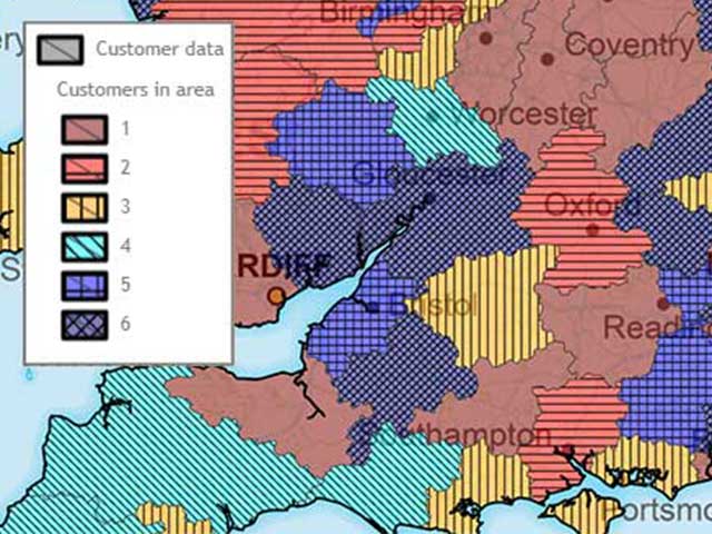
Maps are better than charts in this respect because the colouring often involves large areas, which are easier to discern and separate. The good news is that maps have lots of other attributes that help you to show/hide your message/the truth: projection, scale, resolution, etc. A large area filled in a pale pastel colour can be made less significant than a vivid neighbouring smaller area. Of course, we would prefer it if mappers used different fill styles (symbols or cross-hatching) to make visual distinction less reliant on colour.
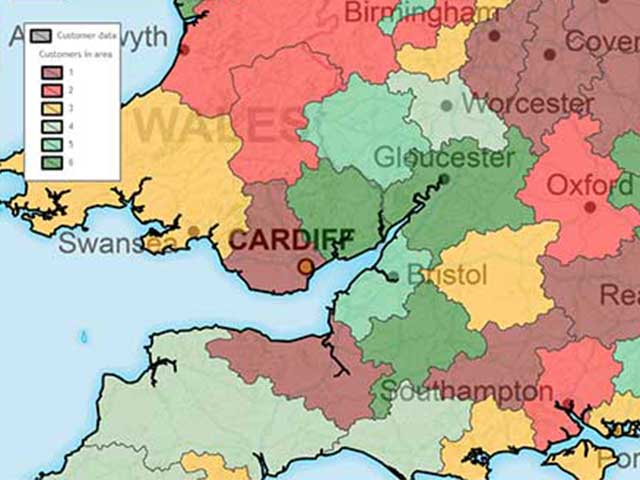
Avoid the traditional RAG (Red-Amber-Green) colour scheme in your maps, even (especially) if you are mapping life or death statistics. Red-green colour blindness is the most common type and, even without colour blindness, the human eye finds it particularly difficult to differentiate shades of red. Ideally, use a unique colour, rather than shade, for each data variance accompanied by other visual cues such as pattern.
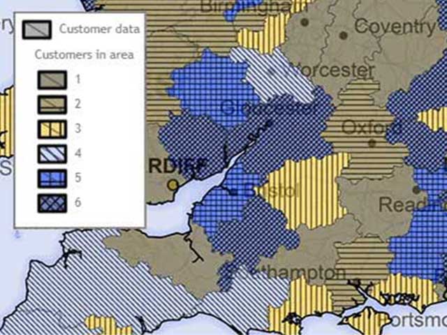
If you are limited to a handful of colours, then consider that the human eye is better able to differentiate blues and greens – and they often look less bleak than shading large areas of the population in blood red. For example, if you are creating a choropleth or heat map, rather than using a traditional red, amber, green colour range, make a more literal “heat map” and grade your results from a cold blue up to a fiery red.
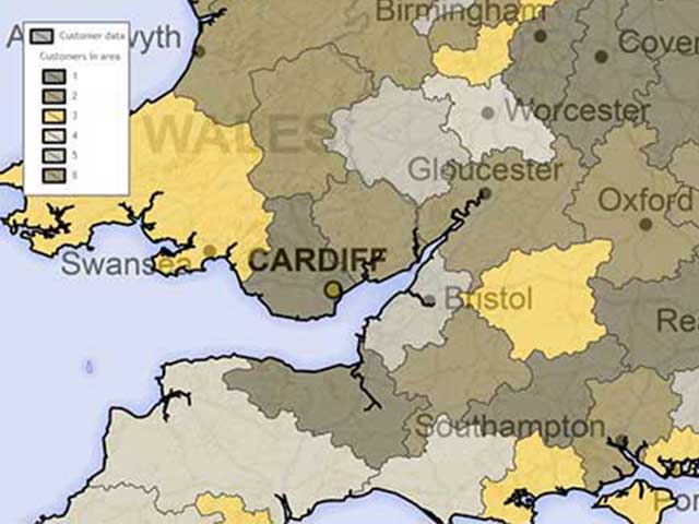
Short of full colour blindness, sufferers tend to struggle with complementary colours: either on the red-green or yellow-blue spectrum. It follows that if you avoid working with a complementary colour scheme you have a better chance of making the data on your map clear to the most viewers. The artists in the audience might cringe but, as a data mapper, creating maps that are easy to understand at-a-glance is far more important than creating a delicately shaded thing of beauty. However, although this works for me, I must emphasise that this will not work for everyone with CB, so always ensure you never rely on colour alone to differentiate your data.
Once you have drafted your map with a thoughtful colour scheme and alternative signifiers such as patterns and data labels you should also check your work for accessibility. People experience CB in different ways and so even I can't hope to provide a fair evaluation of a visual's overall accessibility. Whether a colour scale works for everyone or not depends upon the specific shades of colours used and the colour contrast ratios between them so it is difficult to make general rules.
Fortunately, Google have introduced a Colour Blindness rendering option into Chrome - tucked in their developer tools - to simulate how we see the world. If you are working with an online mapping tool like MapVision, you can check your workings before sharing your map with a wider audience. There are also organisations out there dedicated to helping you make your work as accessible as possible, one of the more prominent is Colour Blind Awareness who are very active on X (formally known as Twitter).